We have a secret to tell you. Did you know that the purpose of a registration flyer is NOT to close a sale, but to build interest in your program? Most people get confused about the two things, and it's important to understand the difference.
If you’re making a registration flyer, you need to be cognizant of certain tips to garner real attention from your potential clients. Read on to see what these tips for designing registration flyers would be.
1. Use a professional image that pops
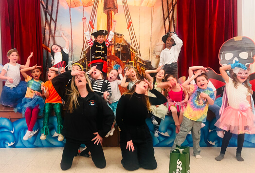
What makes a professional photo? One might assume it’s captured on a high quality camera with a perfect backdrop, but that’s not necessarily the only parameter. In fact, pictures from your smartphone can fit the bill as well! People respond to authenticity and seeing the real side of your business, so having random stock photos that have poor resolution on your registration flyer wouldn’t be as ideal.
Don't cut corners on the image, as color draws people's eyes in and makes them stop and read your registration flyer. The primary colors—red, blue, and green will make your registration flyer pop and stand out.
2. Keep the text short and sweet.
The adage less is more applied vehemently when designing registration flyers. You have a lot to say about your program, but it's better to keep a few secrets when talking about your offerings on your flyer.
Think about the top 2-3 points that you would want to convey about your program and keep it to that. A lot of text on a page makes for an essay someone won’t be interested in reading as they’re walking by. When thinking about your flyer's efficacy, what do you consider the two main points you’d want to highlight? Think on it, and then write it!
3. Have your contact details clearly marked
You need to let your potential clients know how they can reach you. The easiest thing would be a phone number or email address, but social media accounts are smart to include as well.
An Instagram page with lots of other details and pictures will help you with marketing your program better. Consider highlighting a Facebook page where you share videos of your programs and happy clients!
Have a clear call to action
What do you want your potential client to do once they read through your registration flyer? What action do you wish for them to take?
That's an important question to ask yourself when coming up with flyer design ideas. Do you want them to call you? Or do you want them to go to your website?
Place your call to action (CTA) clearly on the registration flyer, so no one can miss it. People reading the flyer from a bit of a distance should be able to see your CTA loud and clear. Make it pop!
Making a registration flyer pop is easy
If you follow the tips listed above, you’ll be well on your way to get the undivided attention of your potential clients and leads. Your small business needs proper marketing, so your program can flourish and grow.
Don't skimp on time, effort, or creativity when making a registration flyer. They are well worth the effort you would spend on them.
If you are interested in educating yourself on more tips and tools related to building your education-based business, then check out Sawyer Tools Blog today!


.png)


.avif)


